Progress Report (November 5)
I appreciated what I learned throughout Design is Storytelling, but from this reading, something that held my attention was the use of affordances in storytelling. This is something to which I had not previously given much thought. I see now that affordances are everywhere and invite interaction, whether intentionally or not. Affordances exist physically and digitally and can be used strategically as a part of storytelling and interaction with viewers or participants. Including affordances primes the viewer so that they interact with the story the way the designer or storyteller wants them to. This section of the reading gave terminology and a meaning to something I had not previously been able to articulate.
This reading put some of my feelings toward accessibility in museums into words. This Summer, when I attended the Venice Biennale with my study abroad class, I enjoyed the experience but did not realize until later, when another student brought it up, that the entire Biennale was fairly inaccessible to anyone with mobility issues or any differently-abled people.
I agree that it is important to design for all of the senses, not just for vision. Designing to appeal to different senses also helps us as designers to think critically about what we are creating and all of the different ways it can be perceived, and we should start the process with this in mind.
Universal or Inclusive Design feels to me like the logical direction for all forms of design to move toward.
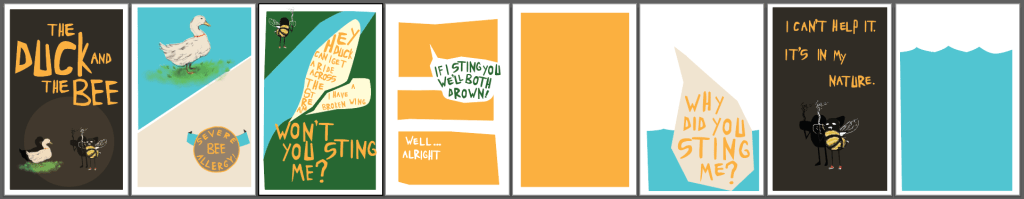
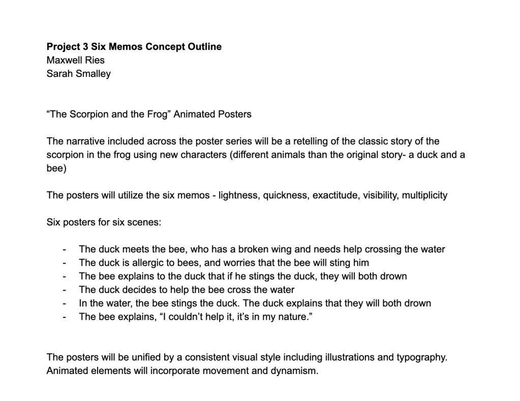
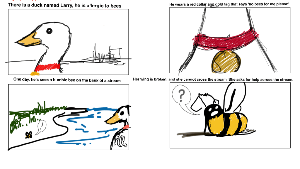
We have refined our idea for project 3 so that it has a stronger narrative development rather than simply illustrating the six memos. We will still create a poster series, but now it will be a retelling of a classic story:

Good Data Viz:
https://pudding.cool/2018/08/pockets/
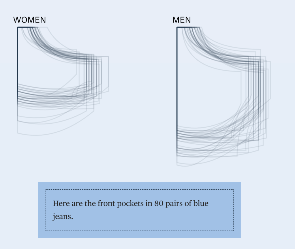
This interactive data visualization tells a story of pockets in women’s and men’s fashion. It is a short article that includes data visuals as you scroll. The numbers are presented in a way that can be quickly understood through visuals. The visuals compliment the story but can be understood alone.
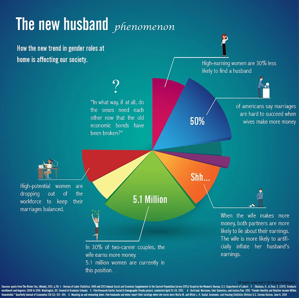
Bad Data Viz:
Most of the feedback I received for project 2 was to work on my pacing. The adjustments I have made to this version of the video include cleaning up some of the timing on the audio so it feels more comfortable and less rushed and choppy, as well as extending the timing on the call to action at the end of the video so that it can be more easily read by the audience.
Jane Alison’s discussion of narrative included some eye opening thoughts. Thinking of narrative as different potential shapes helped me, as mostly visual learner, to visualize what a story’s experience might look like. Radial and circular narratives create a different experience than the typical arc or wave. The “explosion” example was most interesting to me. Alison describes radial or explosive narratives as those centered on a certain event or idea within the story, from which all other elements are related and pulled toward. I appreciated the notion of form and “shape ordering life.”
Alison’s article was insightful but heavy with references and while I understand how narrative in writing relates to narrative in design, I felt overwhelmed by some of the writing references and had a hard time relating this reading to my own work as a designer. Still, I think I did get a broad understanding of what Alison was trying to say: that narrative can take different shapes and that we should allow our stories to organically take those shapes rather than fitting into a traditional one, because humanity and life can’t always fit into a traditional shape.
