Good Data Viz:
https://pudding.cool/2018/08/pockets/
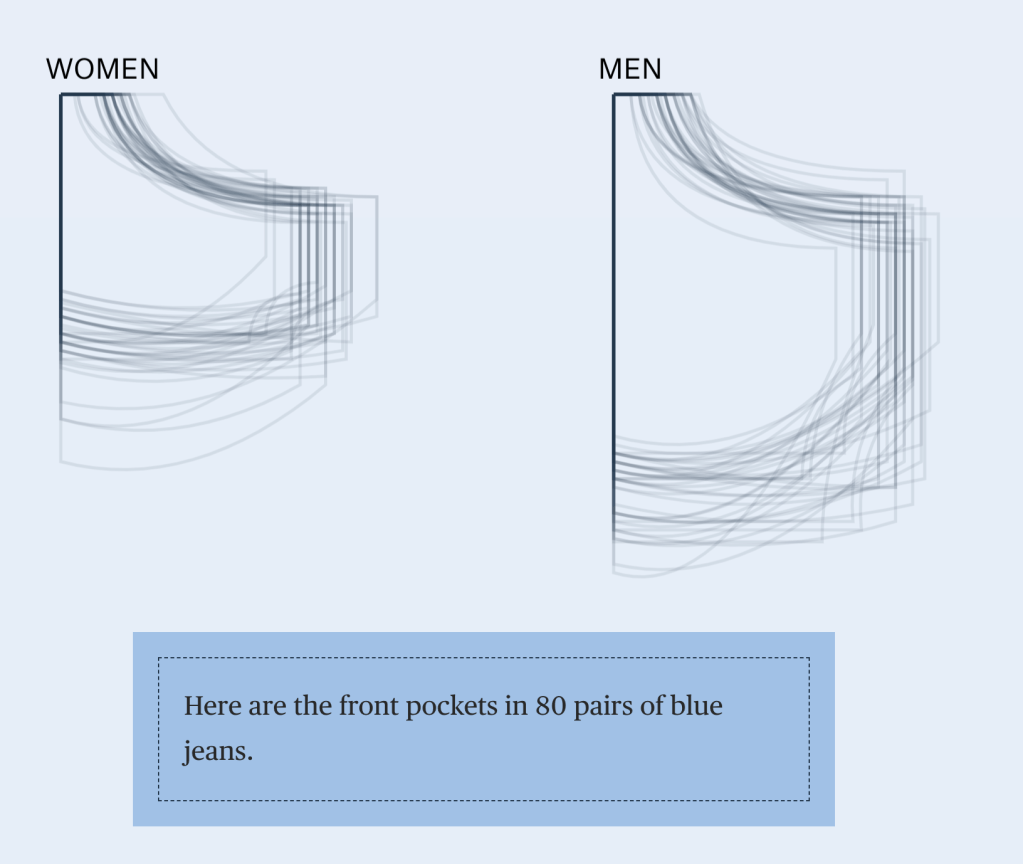
This interactive data visualization tells a story of pockets in women’s and men’s fashion. It is a short article that includes data visuals as you scroll. The numbers are presented in a way that can be quickly understood through visuals. The visuals compliment the story but can be understood alone.
Bad Data Viz:
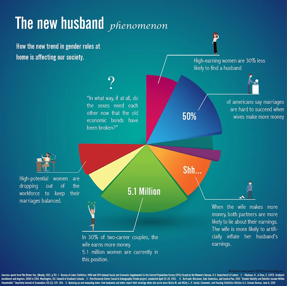
This data visualization is poorly execute because it doe snot communicate an actual story based on data. It is a series of concepts and data plotted poorly and haphazardly on a pie graph. The numbers included are not related and do not add up to represent a whole number or population. The numbers included on the graph itself are both whole numbers and percentages. The data displayed here cannot be understood or trusted based on its presentation.
